I just did a small design, can't upload it to post it because at work, could somebody please send me their email address, I'll put it to you to upload if that is ok?
I think if you used a few of these idea's together we could come up with something excellent.
Thanks
Ian
SE Merchandise
Re: SE Merchandise
Ian Duncan
Re: SE Merchandise
andyc wrote:Find an example and post it up for looksee......
Edit:
Obviously I don't want to trample my way in with a new logo as a relative newbie, so can we have some comments/thumbs up (or down) form the mods, vips, racing drivers, old boys...etc etc before anyone gets upset. Rebranding/logo changes may not suit everyone and I would hate to offend the 'old skool' folks!
Andy they look excellent, only just looked back after my post, I had an idea but am very bad at putting it to something on the computer. Not sure which program you use. Anyway could I send you what I have by email, maybe with a few touch ups by you it could be something good. Can be modified in any way you like if you feel any inspiration.
Ta
Ian
Ian Duncan

Re: SE Merchandise
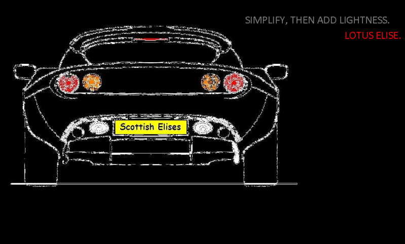
perhaps, would like to see it first, even if it's just the two typefaces side by side. Still think the font for 'scottish' is too plain.Shug wrote:That would look properly horrific IMO.mac wrote:I'm being a bit picky here, but I don't like the font for Scottish.
We have elise in the one of the elise fonts, could we not get the Scottish in the other (can't recall which one is which but the S1 had a different font to the S2)?
Just a thought
Mac
S2 Elise (cobalt blue with stripes) - toy spec
Caterham 7 - hillclimb spec
Yamaha Thundercat - 2 wheeled toy spec
Caterham 7 - hillclimb spec
Yamaha Thundercat - 2 wheeled toy spec

Re: SE Merchandise
It's my mate who did it for us. Email across your idea anyway... andy@proebureau.comAndy they look excellent, only just looked back after my post, I had an idea but am very bad at putting it to something on the computer. Not sure which program you use. Anyway could I send you what I have by email, maybe with a few touch ups by you it could be something good. Can be modified in any way you like if you feel any inspiration.
Ta
Ian
Blue S2 (sold to the plumber)
Seat Leon Cupra Commuter Car
Black Chrysler Grand Voyager Family Bus (Fully loaded spec!)
Seat Leon Cupra Commuter Car
Black Chrysler Grand Voyager Family Bus (Fully loaded spec!)
Re: SE Merchandise
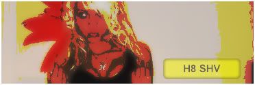
Do we have a supplier for the merchandise sorted or shall I ask my mate to put a package of possible merchandise together so we can see what he can offer and prices etc? Pic below as a reminder of the proposed design so far..

Blue S2 (sold to the plumber)
Seat Leon Cupra Commuter Car
Black Chrysler Grand Voyager Family Bus (Fully loaded spec!)
Seat Leon Cupra Commuter Car
Black Chrysler Grand Voyager Family Bus (Fully loaded spec!)

Re: SE Merchandise
I think it would be fair for everyone to get a few more ideas together then vote. As Jen had been done some phoning about for suppliers I think, it might be also fair to disuss with her too. Keep everyone involved so to speak.
Personally I love the car and the scotland flag in your mate deisgn Andy, but I think the URL needs work, maybe all on one line and in a single type face so that the actual URL isn't lost in the design.
Personally I love the car and the scotland flag in your mate deisgn Andy, but I think the URL needs work, maybe all on one line and in a single type face so that the actual URL isn't lost in the design.
Re: SE Merchandise
Cool. I'm happy whatever we do 
Blue S2 (sold to the plumber)
Seat Leon Cupra Commuter Car
Black Chrysler Grand Voyager Family Bus (Fully loaded spec!)
Seat Leon Cupra Commuter Car
Black Chrysler Grand Voyager Family Bus (Fully loaded spec!)
Re: SE Merchandise
just a concept with some of the feedback above.

Re: SE Merchandise
I like it, I sent mine to Andy, see what can be done with it. It's quite different though.
Cheers
Ian
Cheers
Ian
Ian Duncan

Re: SE Merchandise
Ian just sent me this. Probably used though in a different context.
tut
tut

Re: SE Merchandise
I think the "scottish" is like the LOTUS font and works pretty well, but that's just my opinion, whatever happens the basic design looks really goodmac wrote:perhaps, would like to see it first, even if it's just the two typefaces side by side. Still think the font for 'scottish' is too plain.Shug wrote:That would look properly horrific IMO.mac wrote:I'm being a bit picky here, but I don't like the font for Scottish.
We have elise in the one of the elise fonts, could we not get the Scottish in the other (can't recall which one is which but the S1 had a different font to the S2)?
Just a thought
Mac
S1 Elise - LRG MMC
Exige 390 LRG
GR Yaris
Leighton T6.1
Exige 390 LRG
GR Yaris
Leighton T6.1
Re: SE Merchandise
The fonts will become clear with the next pics I post....just waiting for an e-mail....back shortly
Blue S2 (sold to the plumber)
Seat Leon Cupra Commuter Car
Black Chrysler Grand Voyager Family Bus (Fully loaded spec!)
Seat Leon Cupra Commuter Car
Black Chrysler Grand Voyager Family Bus (Fully loaded spec!)

Re: SE Merchandise
Hey folks!
I really really love the design of the car and flag and I liked the fonts too. For me, and this is only my opinion, is it's easier to read the words when each word is a different font or on a different line, and one has to concentrate harder to read the longer URL whereas I think the URL should be easy to read at a glance. For example, say when a car is parked and someone sees the sticker, they shouldn't have to stare at it for too long to see what it says, and Scottish and Elises are two seperate words which the brain recognises straight away. Perhaps the longer URL with different fonts? Or if we want it all the same font, on different lines? Do you see what I mean? I also feel the logo should take up more space than the URL
As far as suppliers go, I hadn't actually looked into quotes or anything yet as I have been quite busy at school, but if Paul can get us good quality gear at low prices, Im all for it! I have one request though, I want pink! 
Looking forward to seeing more ideas-mine are crap!! I know what I want to see but I can't seem to put it onto picture!!
Jen
I really really love the design of the car and flag and I liked the fonts too. For me, and this is only my opinion, is it's easier to read the words when each word is a different font or on a different line, and one has to concentrate harder to read the longer URL whereas I think the URL should be easy to read at a glance. For example, say when a car is parked and someone sees the sticker, they shouldn't have to stare at it for too long to see what it says, and Scottish and Elises are two seperate words which the brain recognises straight away. Perhaps the longer URL with different fonts? Or if we want it all the same font, on different lines? Do you see what I mean? I also feel the logo should take up more space than the URL
As far as suppliers go, I hadn't actually looked into quotes or anything yet as I have been quite busy at school, but if Paul can get us good quality gear at low prices, Im all for it!
Looking forward to seeing more ideas-mine are crap!! I know what I want to see but I can't seem to put it onto picture!!
Jen
Re: SE Merchandise
I think there are a couple of good points on the text, the text all the same and on one line is a bit more difficult to read quickly. I think the Scottish in black and stronger text is just too strong for the rest of the image. I think this is demonstrated on the hoody as the Scottish stands out more than the rest. then the rest of the image, then the hoody.
If somebody who knows what theyr doing could weaken the "scottish" either by colour or size/boldness of letters to make it stand out slightly less it would be perfect.
Hope this makes sense
cheers
flip
edited to add - or make the elises.com black with maybe a blue horizontal underscore under in the same swoopy syle as the sketch. Then again thats maybe why I cut granite for a living and not design stuff
Qualityworktops.co.uk
Thekitchendoctors.net
Glasssplashbackscotland.co.uk
Thekitchendoctors.net
Glasssplashbackscotland.co.uk

Re: SE Merchandise
andyc wrote:Do we have a supplier for the merchandise sorted or shall I ask my mate to put a package of possible merchandise together so we can see what he can offer and prices etc? Pic below as a reminder of the proposed design so far..
think that looks class